

SHFT BRAND GUIDELINE
We created the brand guidelines for SHFT, a web platform that provides personalized classes in high-demand industry skills.
Our partnerships with academic and industry institutions ensure that we are offering the most relevant skills for career advancement in the local industry.
SHFT connects beginners with experienced instructors who deliver hands-on learning experiences.
OVERVIEW
ROLE
CATEGORY
Art Direction
Sam Wan
Graphic Design
Clarissa Tan
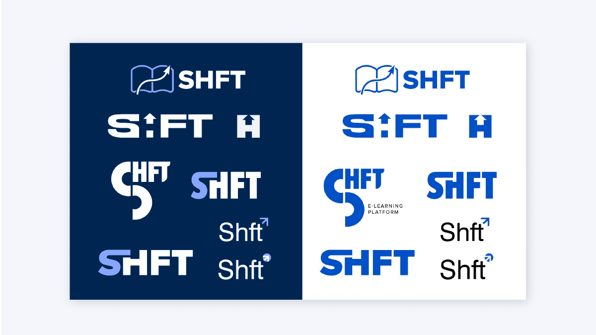
logo sketches for "SHFT"
logo sketches for "SHFT"
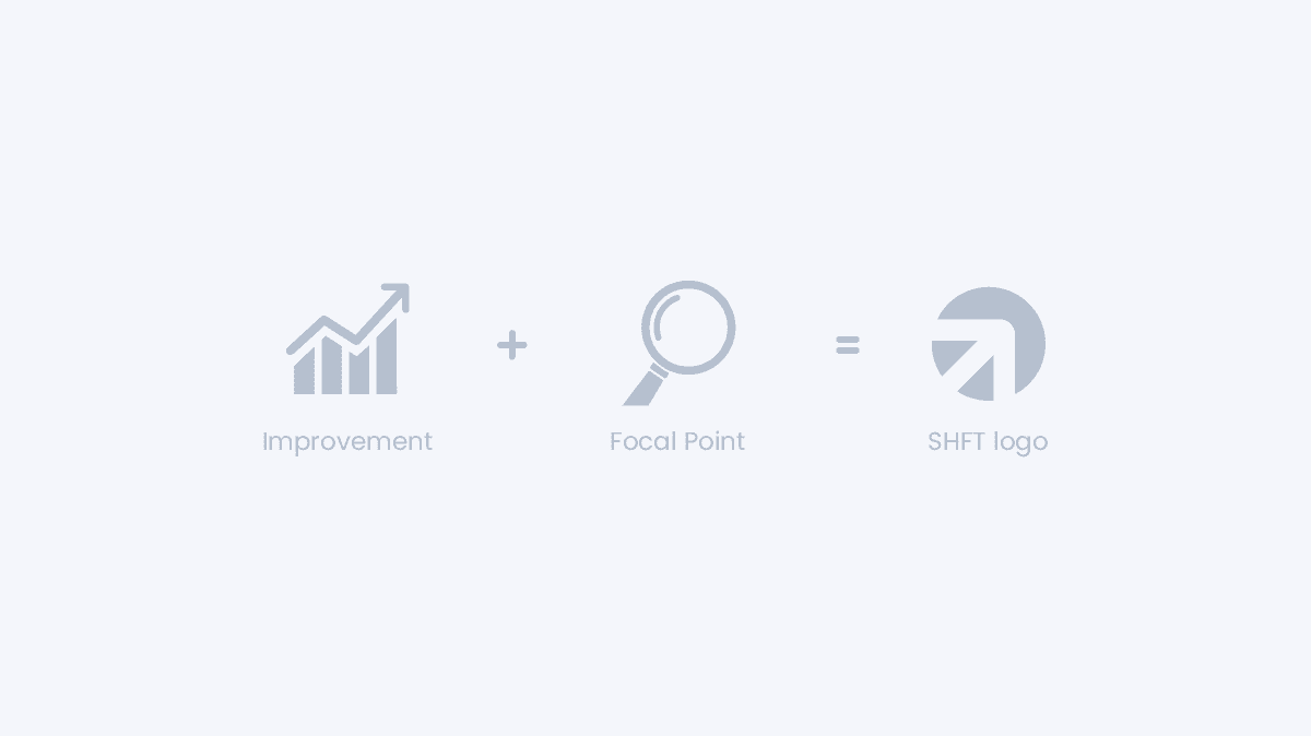
As an educational network that inspires people to improve themselves, we created a wordmark logo to promote our ideology of "focal point + improvement". The SHFT logo represents the essence of SHFT which concentrates on personal development and self-betterment.
The logo proposed was created to make the brand feel more professional, trustworthy, bold and strong. The icon was simplified and built from modern shapes with an arrow pointing up signifying improvement, target, boost, forward, goal and new direction. A modern and minimalistic sans serif typeface is used to invoke a modern look and feel to the brand.
logo sketches for "SHFT"
As an educational network that inspires people to improve themselves, we created a wordmark logo to promote our ideology of "focal point + improvement". The SHFT logo represents the essence of SHFT which concentrates on personal development and self-betterment.
The logo proposed was created to make the brand feel more professional, trustworthy, bold and strong. The icon was simplified and built from modern shapes with an arrow pointing up signifying improvement, target, boost, forward, goal and new direction. A modern and minimalistic sans serif typeface is used to invoke a modern look and feel to the brand.
SHFT BRAND GUIDELINE
We created the brand guidelines for SHFT, a web platform that provides personalized classes in high-demand industry skills.
Our partnerships with academic and industry institutions ensure that we
are offering the most relevant skills for career advancement in the local industry.
SHFT connects beginners with experienced instructors who deliver hands-on learning experiences.
overview
Art Direction
Sam Wan
Graphic Design
Clarissa Tan
role
category


SHFT BRAND GUIDELINE
We created the brand guidelines for SHFT, a web platform that provides personalized classes in high-demand industry skills.
Our partnerships with academic and industry institutions ensure that we are offering the most relevant skills for career advancement in the local industry.
SHFT connects beginners with experienced instructors who deliver hands-on learning experiences.
overview
Art Direction
Sam Wan
Graphic Design
Clarissa Tan
role
category


